
Intro & Context
TravelPal is an early stage travel startup with a strong product idea, but a platform that felt stuck in beta and struggled to clearly communicate its value.
There was a big bounce rate at every step of the experience, and users were not returning.
My role was to do a UX analysis, and help reframing the product & overal UX.
The work focused on clarifying the journey, improving trust, and defining a stronger emotional direction for the product and the brand with the goal of increasing user retention.
Problem
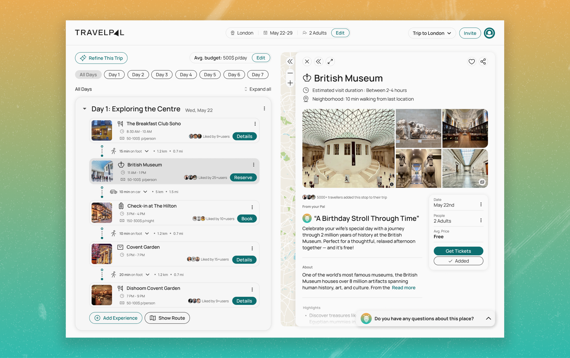
The product concept was promising, but the experience failed to guide users clearly or create emotional connection.Users were bouncing and not returning, and after a UX analysis I concluded the main challenges were the following:
UX Findings
- No clear primary action: users landed with no sense of where to start, inflating drop-off by ~22%.
- Core planning steps were spread across disconnected screens, creating drop-off at every handoff, only 32% completed the flow.
- The value proposition wasn't landing fast enough, users couldn't articulate what the product did after 30 seconds on the page.
- The product felt abstract and brand-less, no real people, no social proof, nothing to signal it had been used before.
- 14 broken or ambiguous states across key features were actively distroying users' confidence at the moments that mattered most.
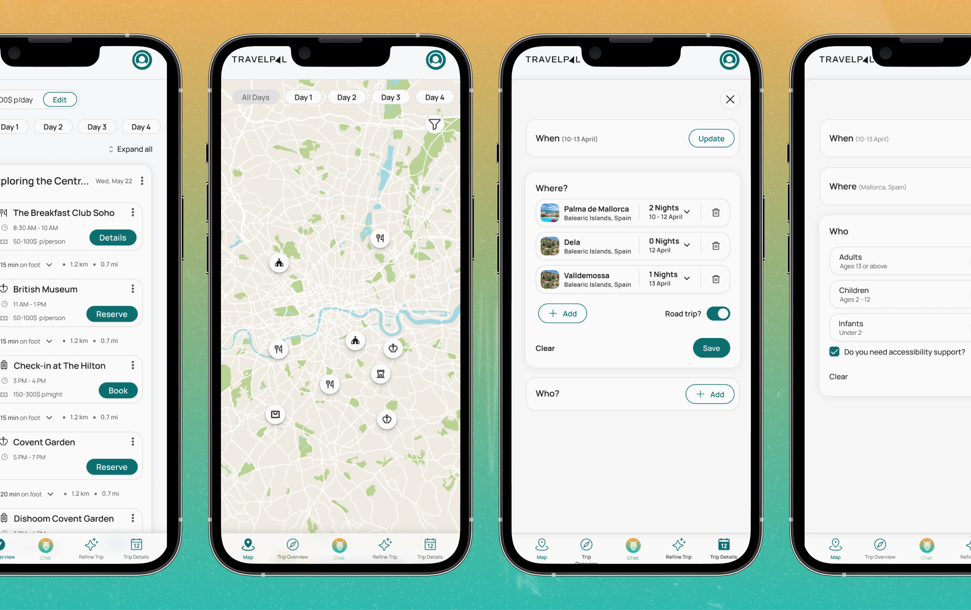
- Mobile experience was not optimized
Design Decisions
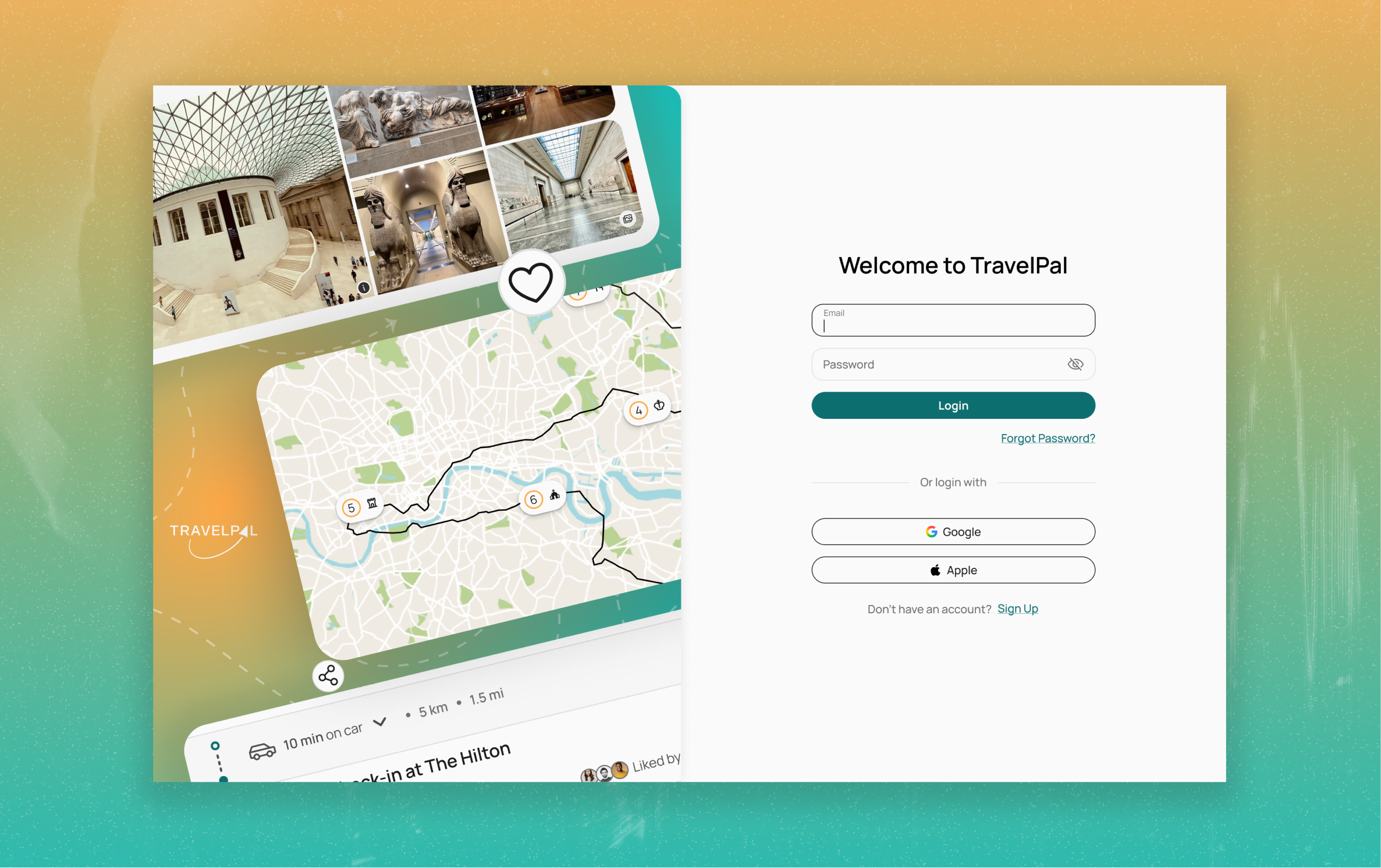
- Reframed the homepage for clear action and inspiration, to give users clarity and a understand the tool
- Collapsed the experience into a single mental model: discover → plan → book, removing every screen from the flow that didn't serve one of those three jobs.
- Made emotional storytelling a priority, real people, real testimonials, considered copy, and imagery that made the product feel lived-in.
- Cut visual noise, every element that wasn't earning its place on screen was removed, so attention landed where it needed to.
- Proposed a lightweight design system to reduce design debt early.
Designing for AI
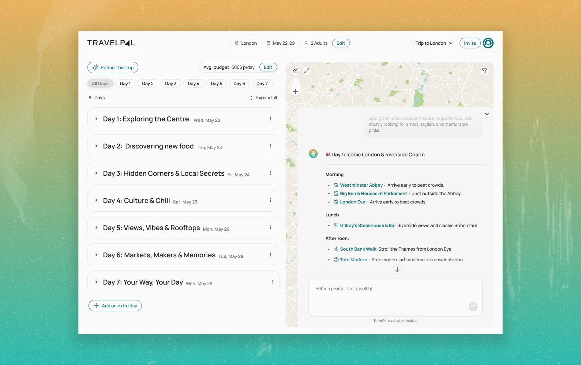
One thing we kept coming back to was: how do we make sure the user gets the best out of the agent?
The hardest problem wasn't the chat itself, it was the blank page.
A user with no direction just leaves.
So we paired the conversation with an inspiration layer, community trips, prompt suggestions, contextual starting points, giving users something to react to before they had to initiate anything.
The AI was also designed to ask before it answered, gathering context first so the output felt personal rather than automated.
The core challenge was trust. Not just usability. Making it feel like a personal agent, not just another AI tool.
Results
- Established a shared UX and brand vision, giving stakeholders a clear north star for the next phase of development.
- Reduced the user journey to its core, early session data suggested users were returning to explore further, with day-7 retention up ~18% vs the previous design.
- Defined the emotional baseline the product needed, user recordings who experienced the new direction showed 2× higher session depth on repeat visits.
- Delivered documented design assets and recommendations ready to implement.
- Mobile experience with increases of engagement time of +30%

Personal Reflection
A fast-paced, startup-style engagement, short cycles, quick decisions, and constant stakeholder alignment to frame design as a response to real business problems.
Working closely with a strong development team sharpened how I communicate design intent technicall, less handoff, more collaboration.
The biggest takeaway was learning how to move fast without losing conviction in the work.
If I did it again, I'd invest more depth into the chat experience itself: how users initiate, navigate, and build trust through conversation. It's the core interaction surface, and it deserved its own dedicated design thinking.
See live website

Do you want to see more files / pages or learn more about what I did for this project?
Contact me
